A "linked chart" is a chart that represents some data that are in a ReportGrid. It may represent one or more measures or grid functions present in the ReportGrid. Initially, it shows all the measures and grid function: the user can deselect the measures which do not have to be represented by clicking on "Section and Colors", in the Chart editor.
For each measure, the user can select or unselect the single values. Initially, for each measure, a maximum of 20 values are displayed the first time (to avoid chart which would not be meaningful), but the user can select all or any subset of them. The chart is built by using the data contained in the ReportGrid.
While displaying the chart, the ReportGrid can be visible or hidden. In any case, the regeneration, drill down or roll up of the ReportGrid causes always a regeneration of the chart, which will always reflect the current data of the ReportGrid.
To add a chart "linked to a ReportGrid"
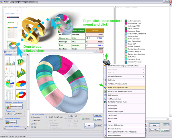
1. Right Click on a ReportGrid to open the context menu and click "Make linked Reportgrid Chart"
or
2. Drag the chart icon image on the a page (in this case if there are more than 1 ReportGrid, a selector will be shown)
When a chart is on the report page you can open the Chart editor anytime, by simply double-clicking the chart.
A chart has a lot of features that needs to be discovered with usage. We call it sometimes a "multichart", as DataTime actually maintains all the information the different charts types and let the user to switch from a type to another one, anytime.
Move / Resize
Within the chart editor:
drag: rotate (for 3D charts)
ctrl-drag : move
ctrl-right drag : resize (for 2D charts)
mouse wheel : resize
On the report page:
ctrl-drag : move
ctrl-right drag : resize (will open the Chart editor for vectorial resizing)